
What is White Space in Web Design and its Importance?
In this post, we’ll give you a brief explanation of what white space is and how it is so essential for web design so you can take what you need from this and then hopefully apply it to your next project aiming for a simple and elegant design.
Nowadays, the majority of websites deliver vast amounts of information. Sometimes that transforms into a messy and complex layout that causes your readers to miss the focus of what they are looking for in your website, feel uncomfortable, and finally leave; that’s why the need for designers to create extremely clear layouts and to understand how whitespace works it’s a key ingredient, so read on!

First of all, what is white space?
White space, also known as negative space, is the spacing between different elements (graphics, columns, images, text, etc.) which contains nothing. It would be best if you didn’t think of this as a space where you didn’t create content but rather a key ingredient in your site layout. As Jan Tschichold wrote, “White Space is to be regarded as an active element, not a passive background.”
It’s called whitespace, but it doesn’t mean it has to be white. The blank space may be filled with any color as long as it is free of elements.
Some designers don’t consider whitespace an essential factor in their designs as they should, which is why some cluttered and unpractical websites exist.
We use it to space out content to achieve excellent readability and usability, making things easier to read and giving the reader a better user experience. It also plays a vital role in the visual layout and brand positioning.
We can separate white space into two levels. These are macro and micro white spaces, relating to the space between core elements and between more minor elements, respectively.
Google is an excellent example of the use of white space.
Why is whitespace so important in web design?
It gives easier readability and scannability.
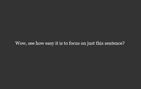
A Cluttered page makes the reader uncomfortable and forces them to avoid content you should want them to read. Adding space between the lines of content creates text that is easier to digest. The reduction of text creates a relaxing feel and helps the visitor in their website experience and text comprehension.
Guides users on a page
You have between 1/10 seconds to create a visually appealing scene for new users on your site; white space is vital in bringing content elements into focus and guiding or leading the user to throw the website.
Creates a visually appealing design and a sophisticated and elegance feeling
Good web designs suggest reliability. Cluttered websites give the user a negative message of being cheap and untrustworthy. That’s why the less is more concept has become essential and is used by many well-known companies. The generous use of white space can contribute to the desired brand positioning.
Highlight user interface elements or CTAs
White space help communicates with invisible elements of the interface what’s most important, what’s related, and what needs attention, giving the user the freedom to be guided to the CTA element.

Finally, this is just an oversight of what white space is and what it includes; we hope this article helps you on your next project to give your readers a more clean, elegant, and attractive design, helping you reach your goals planning to reach.