The Ultimate Guide to Style Guides
Style Guides have been an extremely popular topic in the last few years. And it makes lots of sense. They’ve been with us for years in graphic design, why wouldn’t they be in web design and development?
Many thoughts, opinions, articles, posts and more blog posts have been done regarding the proper creation of style guides. These were initial steps that we had to take to standardise the amazing world of website and digital brand creation. But everything feels chaotic. Where should I start? What’s the first resource that I should look into? Should I make it static or living?
This article aims at collecting the most valuable resources for understanding, analysing and properly crafting your own web style guide. And maybe, just maybe, answering to all the doubts that you had and giving you a direction in which to focus from the beginning.
1. What is a Style Guide and why do you need it?
Style guides are libraries that aim at collecting all the used elements in a given interface. They provide standardisation and help with the mental stability of the team that’s involved in working in a specific app or set of web or mobile applications.
As said before, there are many types of style guides. Originally, by-the-book Style Guides involve a complete design guideline, along with tone, voice, cases of brand use, etc.
They provide a common language that makes the brand work as a well oiled machine, with all its communication and products telling the same story.
On this case, we’ll focus mainly on the web version. The set of UX and UI components, that if done and coded right, can help us greatly in the development of our project, and ease the transition between the design and production process.
However, a good style guide that gets across your whole organisation is complete and cross-disciplinary: Make it for designers, developers, project managers, product owners, business stakeholders, or even anyone who’s remotely interested. Some of the best style guides are completely open to the public, and that’s a good thing.
Much has been said on the last times about style guide driven development, and this is turning to be the way to go if a company really wants to make quick turnarounds into production in a hassle-free manner.
Long ago were the days following the old process, whereas the designer would have to make the change to the PSD, and then the developer would transfer into the specific UI component each time. This would waste lots of time and make everyone’s nerves go through the roof. And an irritable team is something no one really wants.
1.1 This it the ultimate post, but you’ll never create the ultimate Style Guide
As websites and apps, your style guide will be constantly changing. What you aim when creating one is providing a frame for your brand and website to grow.
If it stands the test of time, most elements will remain the same once enough iterations have been done. But as more components are needed it will inevitably grow in size.
2. Geting Started
So, finally! You’ve come here, looking for advice into how to get started and create your first Style Guide with the proper tools and starter points.
The first thing you should do is check for examples. Inspiration makes the world go round, or at least the startup world.
2.1 But… where do I take inspiration from?
Feeling lost? We’ve got you covereed.
- Saijo George’s lovely website showcases a lot of brand style guide examples, very meticulously and detailed for you to watch in awe.
- StyleGuides.io offers help with articles and examples of neatly crafted style guides.
3. Main Components
a. Getting your assets ready
If you want to build your style guide, the most likely scenario is that you already have a website or an app running.
To get everything nice and ready, it is advisable to start with an Interface Inventory.
This is as simple as following these steps:
1. Crack open your project: Get your screenshot fingers ready.
2. Set up a blank template: here is where you’ll dump and categorize the components of the interface. I’d recommend using a program like Keynote or PowerPoint, as you really just need a category title and a place to dump screenshots. I’ve created an interface inventory Keynote template with a bunch of categories to get you started.
3. Start screenshotting: Now for the fun/tedious part. Start grabbing screenshots of the ingredients of your interface. Grab headings, text fields, radio buttons, carousels, accordions, tabs, images, icons, video players, graphs, etc, etc. Note that you’re not trying to capture every single instance of a component, but rather uncover distinct treatments of a component (like a button with a bevel and right-facing caret vs another without any bevel/caret).
4. Categorize screenshots: You can do this as you go or after your screenshotting session, but the goal is to be able to view all the various treatments of a particular molecule side by side.
5. Present the interface inventory: to your boss/client/organization and watch them cry realistic tears.
b. Identifying your components
Atomic design is the way to go for this. It teaches a way of thinking that we are not designing mere websites, but complete design systems. If you haven’t heard about this, read their docs section and their explanation on this wonderful system.
For simplification, I’ll make an example of something that will probably be useful for you:
Atoms: This will be your:
- Buttons;
- Tags;
- Typography;
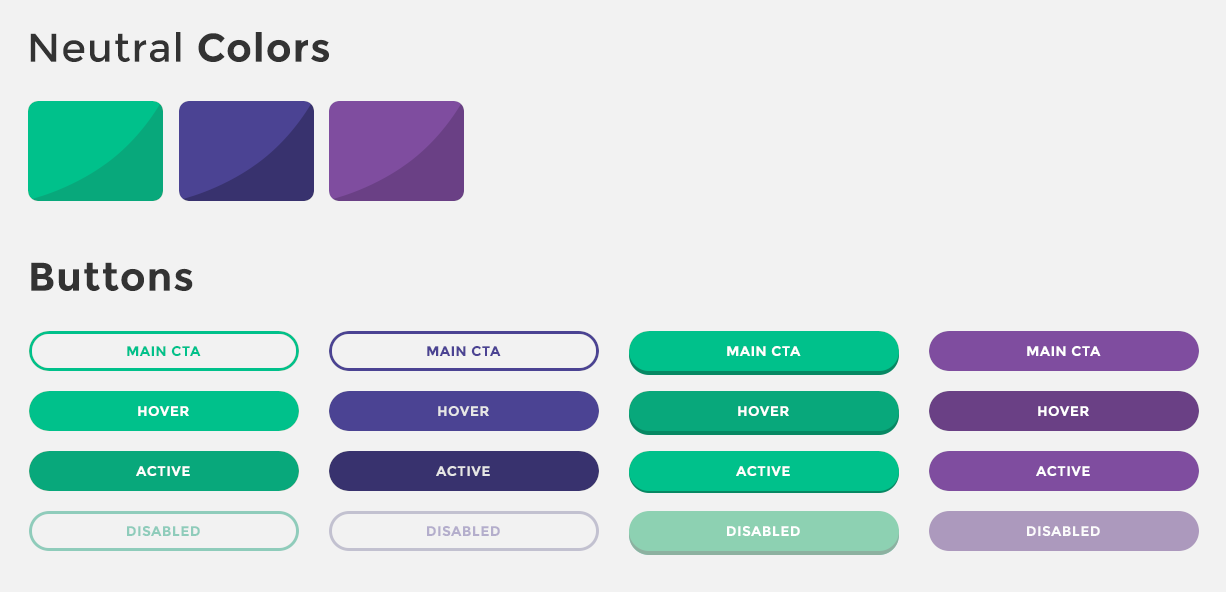
- Colours
You can build out an example like this below, with many more items. By themselves, atoms can’t be used since they are very abstract, but they are the reference and the small pieces of the bigger components that make up your design system.
Molecules:
Molecules will be any of the following and more:
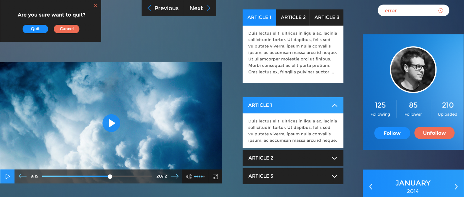
- Search Input
- Date Picker
- Pop-up window
- Form Label
- Individual Product View
- An Item in a List
This is where things start to become more tangible. Molecules can work by themselves and work well in an organism. These will be the main characters in your style guide, since the molecules make up almost everything.
Organisms:
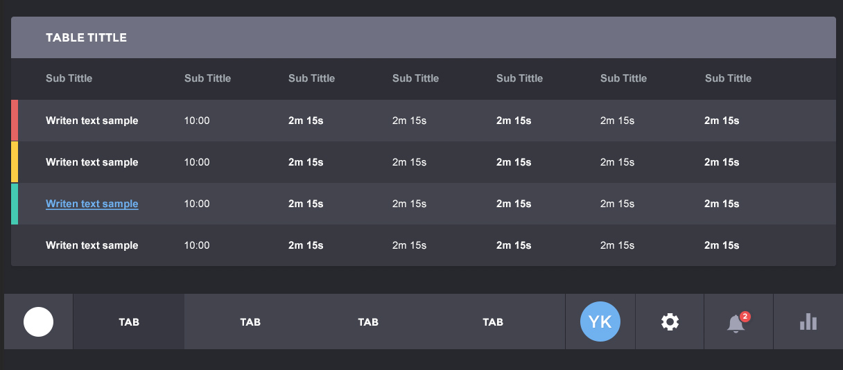
Organisms may or may not be added to the style guide, depending on how used they are or how helpful it would be to add them. You want to be detailed, but adding a product grid that only copies and pastes the same type of product doesn’t make a lot of sense. But for example, adding a header for the app or a series of tables that are very much used is a different story. Use your best judgement on this one.
Templates:
Again, templates and complex page-level objects, like for example a checkout process might be added to the style guide if there is a constant need for using them and seeing them in action or have a reference.
Pages:
This will be the final results, but you will see them as pages on your website or app, no need to add it to the style guide, but keep them in mind because this is the final product of our atomization.
c. Building it out from the design
Now all the components have been properly divided, you can start from the design and branding side of it. This will set several things of your style like:
- Tone
- Voice
- Logo and use cases
- Proportions of logo(s)
- Colours
- Typography
- Collaterals (if any)
This is the graphic/visual design aspect of it and we’ll not dive too much into it. Just remember to do something according to the kind of business. Make it funny if your company tries to be funny, or make it look as professional and sober as possible if you are a law firm. It all depends on the angle and image you want to communicate.
You can check out some resources for building it out properly here:
And with that said, our next point is on how to build it out from the code in..
4. Style Guide Driven Development
The new development towards Style Guides states that these should be built focusing on the templates.
As Ian Feather puts it:
“[Style Guides] should focus on the templates. Crucially, if you’re rendering templates to a Style Guide and you want it to be maintainable then they can’t just be identical to your application templates, they need to be the exact same templates. This is easier said than done.”
“This doesn’t mean it’s impossible to achieve. It does require your application to be built in a modular, component driven way though. Isolating parts of your UI into small components allows you to reuse them around the site as well as compose them to create greater functionality.”
And this is the change that, step by step, we need to start to embrace.
Times and times have I created Style Guides that need to be maintained constantly for them to only fall behind with every change of design.
Focusing on templates makes in maintainable over time because it doesn’t create unnecessary copies. It just references them. It’s not a copy, it’s just a template that’s being called over and over.
This is something that even Photoshop introduced with its Linked Smart Objects. Something that Sketch App does with its Symbols. Why isn’t it a standard in code, where it is a million times easier to produce?
Let’s treat our Style Guide as a standalone app that calls all the components at the same time to generate greater UI conformity.
And to bring into topic, Nicole Sullivan and Colin O’Byrne explain it very well in this video:
It’s pretty clear after this how to proceed in building your style guide from scratch.
5. The Tools you Need
But doing this is easier said than done, and that’s why I’m gonna show you the tools and material that you can use, in order to make this Style Guide a reality:
- An In-Depth Overview Of Living Style Guide Tools
- Automating Style-Guide Driven Development
- MailChimp Style Guide
- StyleGuides.io Tools
- Living Design System
With these set of articles and tools, you got everything you need to make your Style Guide a living environment that it’s not a copy of all your components by itself, but a recall for showing them that gets constantly updated with the retouch of a line of code.
And this is the ideal scenario: A Style Guide that it’s not a burden but a reference for anyone inside or outside your company. A Style Guide that works as an app and is the palette of elements that you have available and can always come to.
6. A little Wrap-up
Much has been said over the past few years about Style Guide creation, development and design of these mysterious holy grails that everyone talks about but no one masters.
And it is ok. Web Design and standards are constantly changing, constantly evolving. Giving a little light to the matter for everyone to see and iterate is what makes this community grow, change and get better.
Today we’ve unravelled the latest standards to convert your web pages into living design systems that are intertwined and change when necessary.
Do you have any links? Any more resources that we could make this even richer? Let us know in the comments area!